For nearly five decades, travelers across America have grown used to seeing a familiar face whenever they stopped at Cracker Barrel. The man leaning against a barrel, known as Uncle Herschel, became more than just part of the logo—he was a symbol of comfort, tradition, and the simple pleasures of homestyle food. In 2025, that long-standing image was replaced with something new, marking the first logo change in 48 years and sparking a mix of excitement, nostalgia, and even frustration among loyal fans.
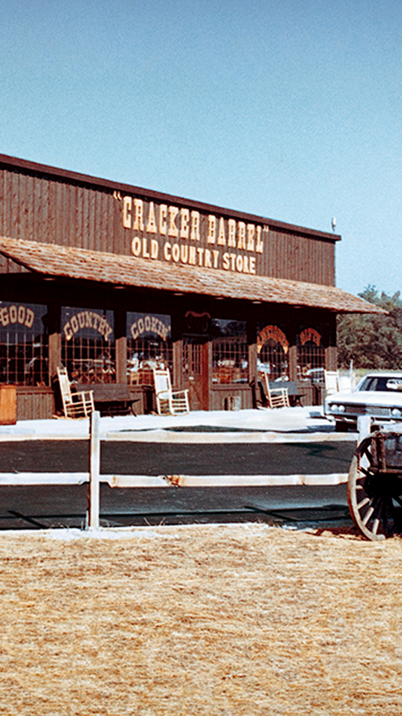
Cracker Barrel’s story began in 1969 in Lebanon, Tennessee, when founder Dan Evins opened the very first location. His idea was to create a welcoming stop for travelers along the highway where they could sit down for a hearty meal and feel at home. The original logo and menu were hand-drawn, and the restaurant looked more like a small country store than a chain. Guests could eat, browse old-fashioned candies, toys, and souvenirs, and then continue on their journey with a little piece of southern charm in their pocket.
By 1977, Cracker Barrel had grown to thirteen locations, and with that growth came the need for a stronger brand identity. That’s when Uncle Herschel entered the picture. Inspired by Evins’ real-life uncle, the new logo showed a friendly man sitting beside a barrel, and it quickly became a recognizable symbol across highways. For nearly five decades, the design remained essentially the same, with only small updates to brighten the colors. Travelers came to see Uncle Herschel not just as a drawing but as part of the experience itself, a marker of consistency in a changing world.
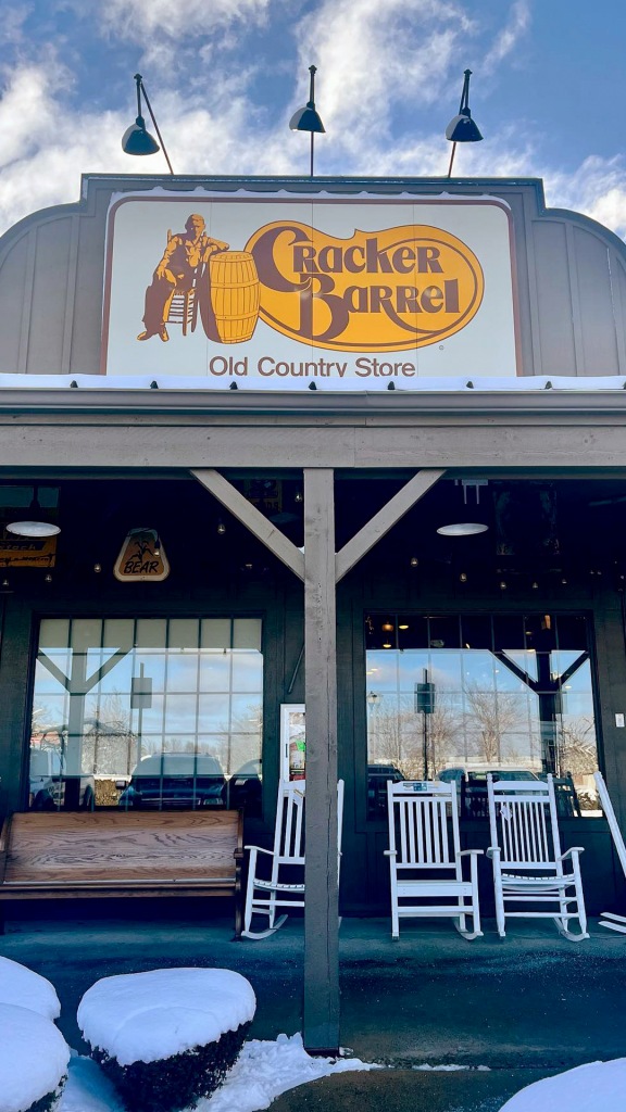
Cracker Barrel became a cultural staple in the years that followed. Families often made it a key part of their road trips, stopping to enjoy pancakes, fried chicken, or chicken and dumplings while browsing the country store for knickknacks and rocking chairs. The porch lined with rocking chairs became an image as iconic as the logo itself. For many, the restaurant was more than just a place to eat—it was a place where memories were made on long drives, holiday weekends, and Sunday afternoons.
That’s why the announcement in 2025 came as such a surprise. After nearly half a century of keeping the same logo, Cracker Barrel introduced a new design that removed Uncle Herschel entirely. The new look kept the familiar yellow and brown colors but switched to a simpler, modern font and a streamlined barrel icon. According to the company, the new design was “is now rooted even more closely to the iconic barrel shape and word mark that started it all.” On social media, Cracker Barrel shared the change with the caption, “You’ve been the best part of our table for 55 years, let’s do some more.”
The reaction from fans was immediate and divided. Some appreciated the fresh update, saying it gave the brand a modern edge while still staying true to its roots. Others, however, were disappointed. For many longtime customers, Uncle Herschel felt like family. One fan voiced their frustration online, asking, “Why did you get rid of Uncle Herschel? Is nothing sacred?” For people who had grown up seeing the logo on family road trips, his disappearance felt like losing a small but important part of their memories.
It’s not unusual for brands to face backlash when changing their logos. A design isn’t just an image—it carries meaning, nostalgia, and identity. Cracker Barrel likely understood the risk, but the decision was part of a broader plan to modernize. The company had already been making upgrades to its restaurants, refreshing interiors and making changes to stay relevant in a fast-changing dining industry. Updating the logo was another step in keeping the brand current while appealing to future generations.
To roll out the new look, Cracker Barrel partnered with country singer Jordan Davis, who recorded a music video as part of the campaign. The choice made sense: music, tradition, and southern culture have always been part of the brand’s image, and tying the new logo to a familiar voice helped make the transition more memorable.
Even with the new design, the heart of Cracker Barrel remains the same. Guests can still expect the same hearty meals, from biscuits and gravy to country-fried steak, along with the cozy shopping experience in the country store. The rocking chairs are still waiting on the front porch, and the warm sense of hospitality is unchanged. Uncle Herschel may no longer be printed on the signs, but his spirit—representing family, warmth, and tradition—still lingers inside every restaurant.
The change marks a new era for Cracker Barrel. While some loyal fans may take time to adjust, the company hopes the refreshed look will help carry the brand forward for another fifty years. For younger generations who may not have the same attachment to Uncle Herschel, the new logo may feel fresh and simple, a fitting reflection of the brand’s promise to keep welcoming travelers and families for years to come.
In the end, Cracker Barrel’s decision to change its logo after 48 years is more than just a design update. It’s a reminder that even the most traditional and nostalgic places sometimes need to evolve. The food, the store, and the atmosphere remain the same, but the sign outside now reflects a balance of history and modernity. Whether people embrace the new logo right away or miss the old one for years to come, Cracker Barrel still stands as a symbol of comfort on America’s highways—just as it has since 1969.